the eponymous blog
What charts are saying—and what they’re not.
The Facebook comment box doesn’t lend itself to long form answers, so I’m responding to a post from my friend Terry Gill here on my (pathetic) blog. He pointed me to this post from Doug Ross, and I wanted to dig into it a bit further. Here’s my take…

Ter;
Respectfully, I’m going to pass on the three words, not four debate. I’m not sure I can add anything meaningful to that.
Looking at the the four charts from your initial post, I do have some thoughts:
Chart 1 compares household incomes between [a] two quarters of negative GDP grown and [b] a financial meltdown. Is it really surprising that the impact on household incomes wasn’t instantaneous? A lot of businesses tried to retain workers, but when the sales weren’t there, had to let them go. Presto, declining household income, during the recovery (GDP hits positive territory in Q3 of 2009.) This seems to be an peanuts to coconuts comparison.
Chart 2 shows the change in gas prices. Again, with the economy in near free-fall, people weren’t flying to DisneyWorld or driving the SUV to Torch Lake as much. Demand didn’t fade: it fell off a cliff. If you look at 5 years, instead of 4, you’ll see the prices have… returned to where they were before the economy tanked. I’m sorry, but this is just a ridiculous, even dishonest argument. As demand returned, prices came back up. That’s the way markets work.
Chart 3 is labor force participation, and I think gets to the crux of the problem: sluggish, even anemic recovery. Plenty of businesses (and state and local governments, and nonprofits) laid off people—and many of those jobs are not coming back. And there aren’t lots of jobs, so people aren’t participating in the labor market. That’s Obama’s (and America’s) big problem. I don’t dispute the data at all. I would like to point out that the vertical range is from 63 to 68%, so it exaggerates the shift.
I can’t lie: chart 4 isn’t entirely clear to me. I get that the blue is the stimulus spending which increased the deficit. I’m not clear on the “CBO March Baseline.” I think the yellow is CBO’s expectation of spending based on appropriations under current law. Red is CBO’s analysis of Obama’s budget. And the CBO is taking a hard look the president’s proposals and crunching the numbers. I’m sure their math is right (and I have *no* desire to proof their work.) But I would like to point out two things: [1] Congress doesn’t appropriate based on the President’s budget. Period. Even when the President’s party controls both houses of Congress. (Bush, Obama.) Second, the CBO projections have no way to account for subsequent appropriations and changes to the tax code. So while their math is sound and their projections are reasonable, what actually will happen is entirely up for grabs.
And since an election is about choices, I’m interested in your thoughts about Romney’s plan and its impact on the deficit.
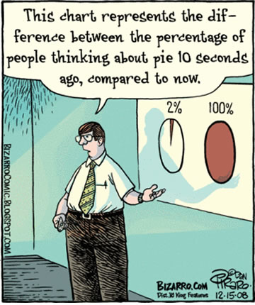
I’ve put far too much thought into this post—I’m off for a slice of lemon pie.
Oops. I broke “The Google.”
Trichromatic
Great line from the NY Lottery
On art.
[pullquote align=”left”] The aim of art is to represent not the outward appearance of things, but their inward significance.
—Aristotle [/pullquote]
[label style=”success”]Success label[/label]


